V0.8. Everything merges together !
Hello everyone,
The time has come for our 8th dev log !!!
And a lot of things happened this week !!
The goal of this week was mainly to merge the artistic and programming work together, and it gives a stunning result !
Of course, we also iterated on puzzles and created brand new challenges in the game.
Art time :
Models:
Made the rig for the battery character overall i kept the rig very simple seeing that it wont be used to create difficult animations so it's mainly focussed on making animations for our game. This way we can work faster and get more things done in a shorter time.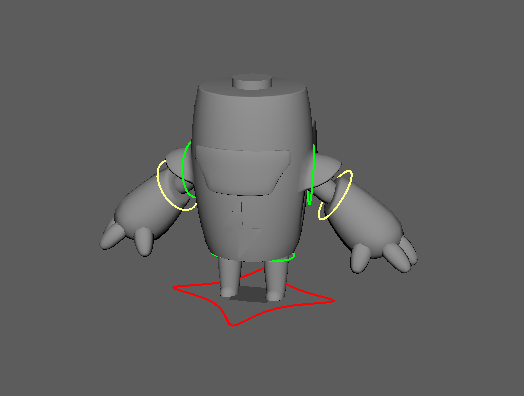
Particle:
Added a particle for the wind character's blow. For the particle a asset pack was used and the particle was changed to a more desired particle for our game.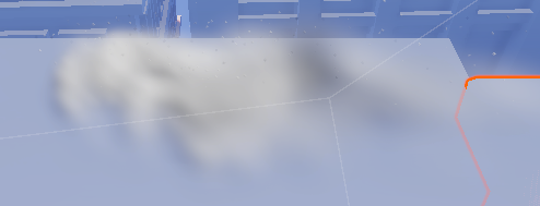
Particle:
Added a particle for the elictric orb that will be shot by the battery character. For the particle a asset pack was used and then the particle was changed to a more desirable particle for our game.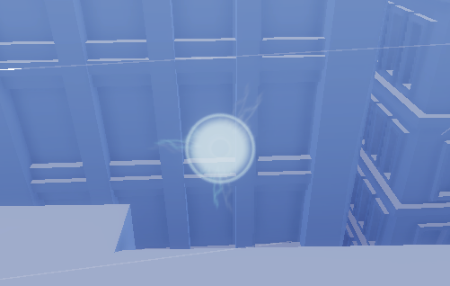
Particle:
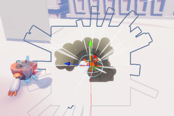
Added particles for the enemy character. One particle is for the stun to visualize when the enemy is stunned. The other particle is for when the enemy explodes. For both particles a asset pack was used and afterwards the particles were changed to a more desirable result for our game.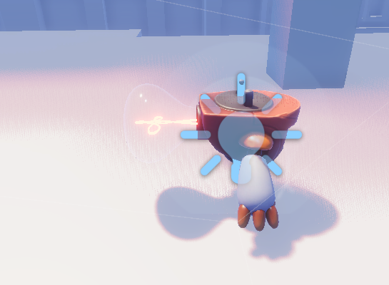
Animation:
Made a move animation for the battery character. For this animations i kept it very simple seeing that the character will only be seen from a distance.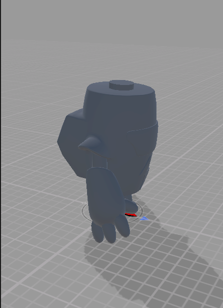
Animation:
Made a walk and idle animation for the enemy character. Due to a unexpected error it took a very long time to get the animations from maya into unity. But eventually we made it work. For these animations we kept it very simple seeing that the enemy will only be seen from a good distance away.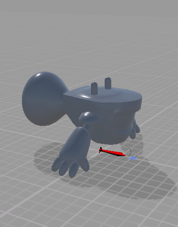
Animation:
Made a animation for when the fan is moving. Again this animation is very simple seeing that the character will only be visuable from a great distance away.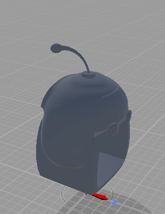
Puzzle:
Added some extra puzzle idea's including an idea for a maze. Overall this went pretty smoothly and i am trying to make the puzzles with more interactions.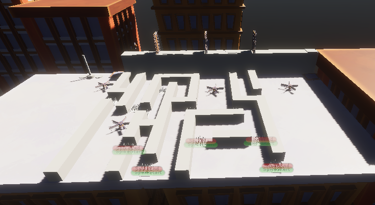
Programming time :
Physic based rotating platforms :
If you remember well, last week I worked on the movement of the moving platforms. My goal was to make their movement physical in order to make the player follow its movement. This week I applied te same ideas but for the rotating movement of the rotating platforms.
A living HUD :
This week was mainly focused on creating stunning effect and here is one of these. In the back of both characters models, there are batteries. We use these batteries to show to the players the amount of energy each character has. Depending of the amount of energy of the character, the color of the batteries will change going from green (100%) to yellow (50%) and then to red (empty battery). We used emissive material for the batteries, so the emissive intensity of the material will also lower when the amount of energy is going down.
Time to blow ennemies :
From now, I gave the capacity to the fan character to blow the enemies. when the enemies are blowed, they are pushed in a certain direction and they are affected by gravity, this give a kind of ragdolly effect when the enemies are pushed away. after a few second of push, if the enemies are still on the map, they will try to go back to their original position. If they fall off the map, they will just be destroyed in a beautiful explosion !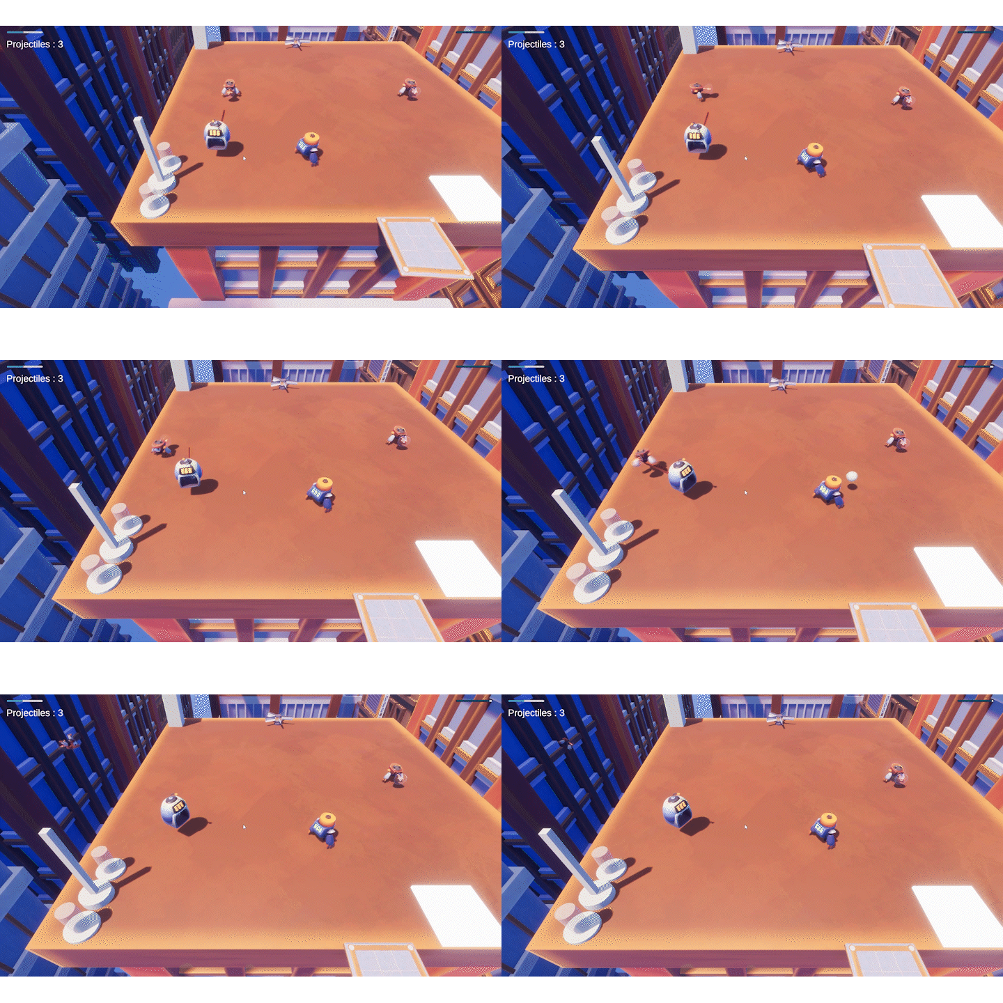
A stunning effect ! :
Last week, we implemented the fact that the enemies can be stunned when they're hit by an electric orb. We had a main problem, when the enemies where stunned, there were no feedback about this, they just stopped moving. Start from now, the enemies generate beautiful sparkles when they're stunned !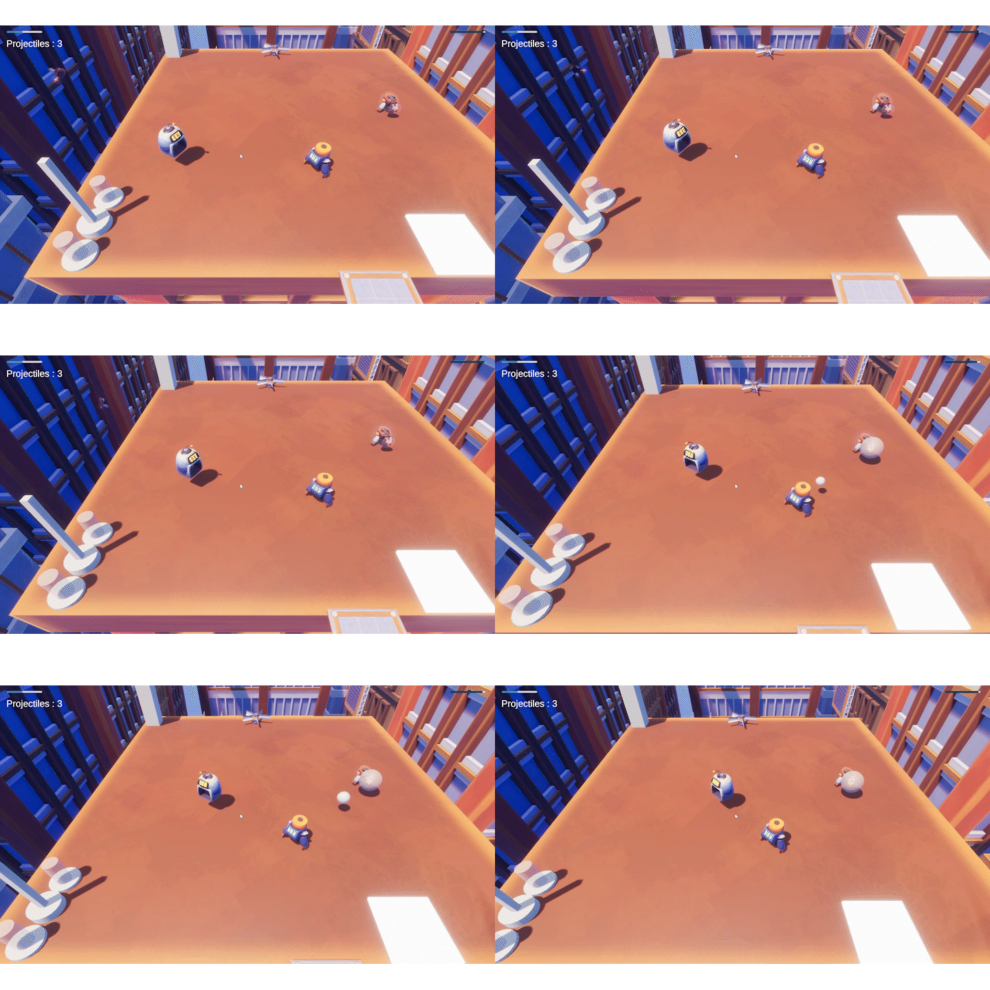
An effect to recharge our minds :
A few weeks ago, we implemented a recharge mechanic, the battery has to ability to give its energy to the fan. We evn created a cable that connects both character. Eventhough, it still wasn't really clear that the first character was recharging the second. We created an electric orb particle effect that moves along this cable to show that energy is transferred.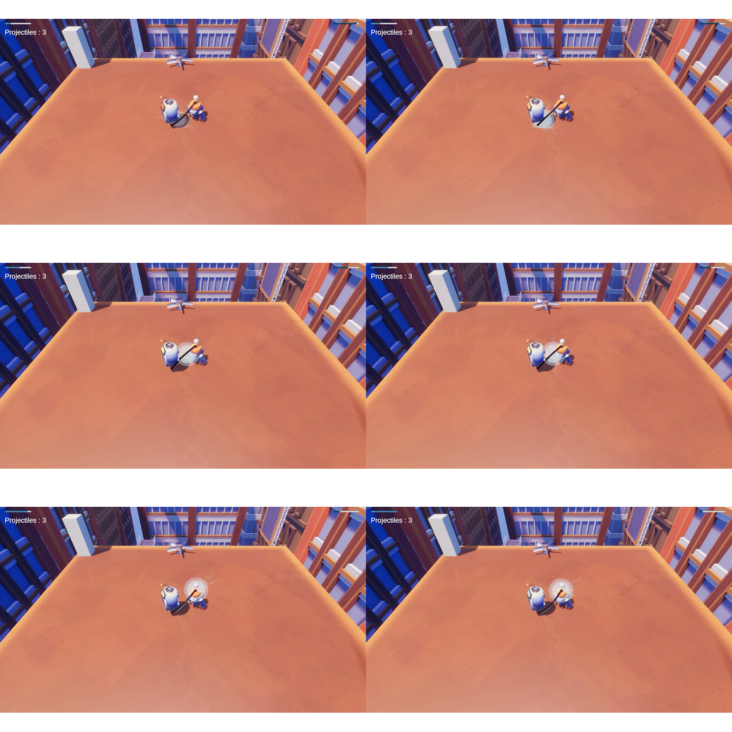
A blowing effect :
One of the core mechanic in our game is the ability of the fan to blow. (That's crazy it is even in the name of the game !!!!) But until now, this mechanic had a huge default. It was absolutely not clear when the fan was blowing and what was the range of its blow. This isn't a problem anymore !!! a magneficient tornado is showing the blow range of the character.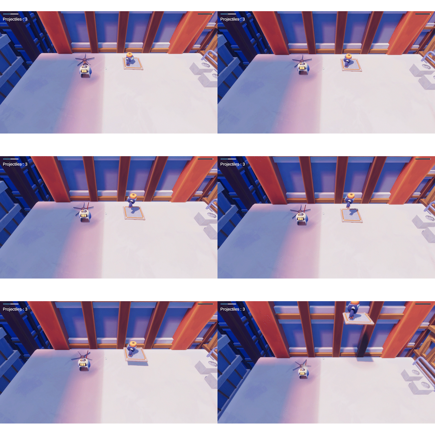
Giving some movement to this game ! :
Until now, our game was pretty static, we started to give some movement to it !!! From now, the battery isn't sliding on the ground anymore, but it has a magneficient walk animation. I accelerated the base animation to give a more robotic effect.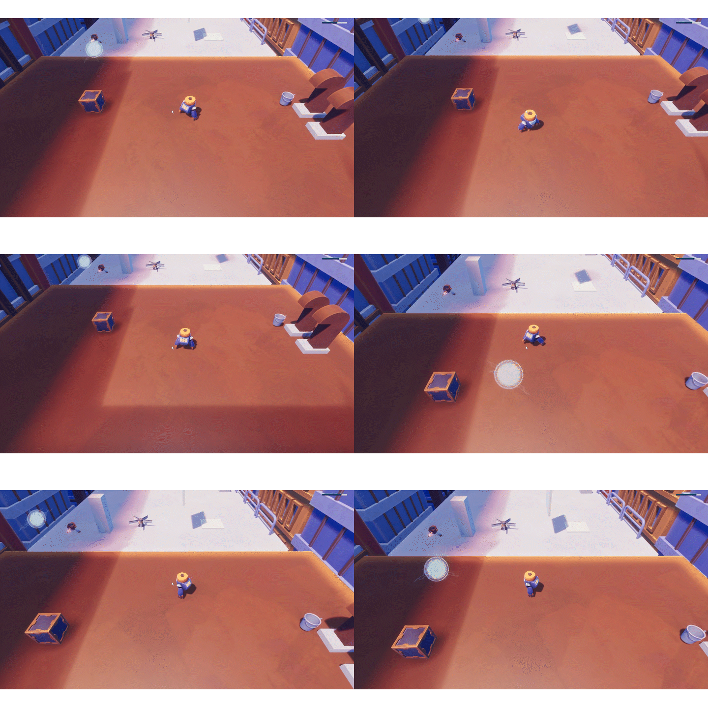
Grinding the sidequests :
Except all that new stuff, this week I also worked on a lit of secondary small elements. Mainly, I fixed bugs and I cleaned our main scene that became a mess to work in.
Start menu comes in:
This week also saw the introduction of a start menu, now the player isn't directly dropped in the game anymore but is welcomed on a beautiful screen.
This week i went deeper into UI wich was intresting i learned alot especially about the diffrent type of UI so you have 2 main diffrent UI type makers in unity one is the Unity Legacy the other is the UI tookkit which is way newer and after more research these are the positives and negatives i found for both.
Unity UI Toolkit:
Performance:
Unity's UI Toolkit offers improved performance compared to the legacy UI, making it more suitable for complex UI setups.
Flexibility:
It provides greater flexibility in creating custom UI elements and layouts, allowing for more creative and dynamic user interfaces.
Ease of Use:
The UI Toolkit offers a more intuitive interface for designing UI elements, making it easier for developers to create and manage UI components.
Integration:
It seamlessly integrates with other Unity features and workflows, streamlining the development process for Unity projects.
Scalability:
It's designed to handle UI elements at scale, making it suitable for projects with large and complex UI requirements.
Legacy UI:
Familiarity:
Developers who are already accustomed to the legacy UI system may find it easier to stick with what they know rather than learning a new system.
Stability:
As a mature and well-established system, the legacy UI has been thoroughly tested and is generally stable for use in projects. Documentation and Community.
Support:
Since it has been around for longer, there is more documentation and community support available for the legacy UI system, making it easier to find solutions to common problems.
Compatibility:
It may be preferable for projects that need to maintain compatibility with older Unity versions or have dependencies on legacy systems. For the start menu i used the new UITool kit as its has alot more and is easier to work with in my opinion. But it took me a while to learn it because its was uss and xml files and stuff and its a new system so i was just testing things out
I hope you enjoyed your reading.
The release is coming incredibely quickly, and we really hope you'll enjoy our final game !
Again, thank your for the attention you put in our game.
Files
Get Blow It !
Blow It !
| Status | In development |
| Authors | Sybe Rymenants, Xal3o, Noah Vroman, ausrineval |
More posts
- V1.0 Official Release !May 28, 2024
- V0.10. One more update before the endMay 23, 2024
- V0.9. EVEN MORE ART!May 16, 2024
- V0.7. Masterminds of the puzzleMay 02, 2024
- V0.6. The Dawn of an actual gameApr 25, 2024
- V0.5 It is going technicalApr 18, 2024
- V0.4 Production has started!Mar 28, 2024
- V0.3. Prototyping comes to an end : Dawn of the design !Mar 21, 2024
- V0.2. The RedemptionMar 14, 2024

Leave a comment
Log in with itch.io to leave a comment.